
IKEA HK
IKEA HK Omnichannel platforms
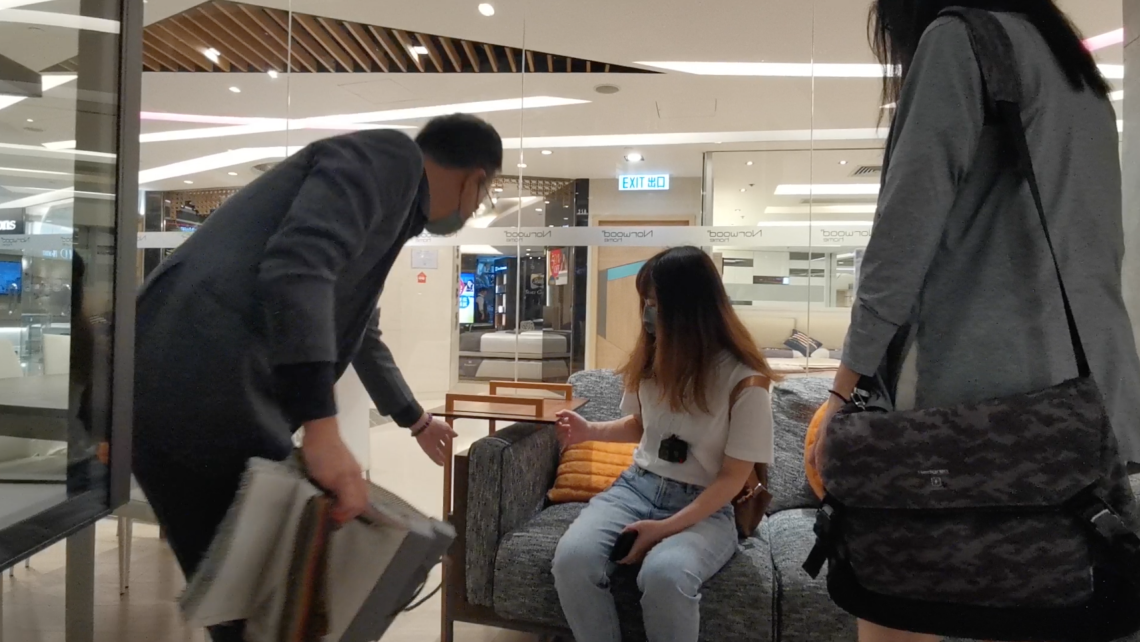
Role-play & Site Visit
To understand more about the users' view and thoughts, we did a role-play and site visit in IKEA. We tried to use different platforms from IKEA and see if there are any strengths or weaknesses on the existing platforms.
Scenario
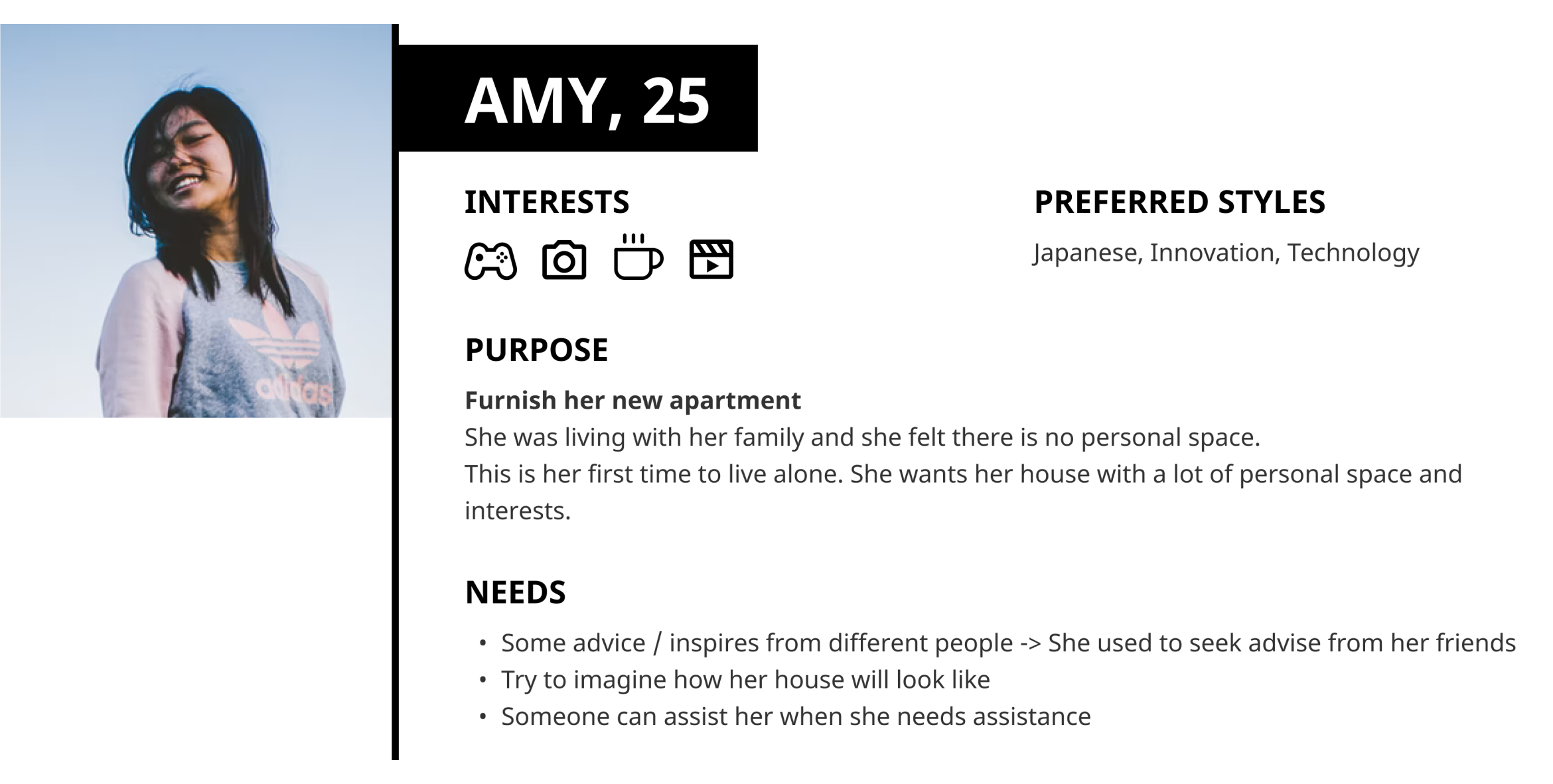
HK local young people to leave their families, move out, and live alone.
Venue
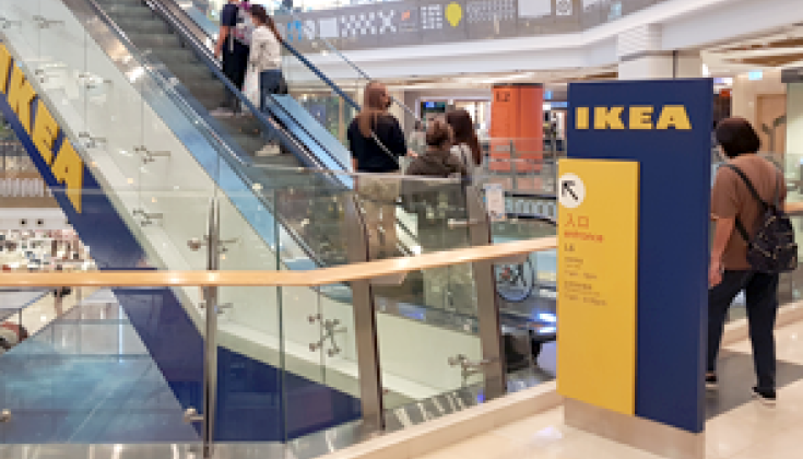
Shatin IKEA — HomeSquare


Characters & Assumptions

Financially stable; new in living alone; need to fill the empty apartment

Already owns a home

Help to take the video for the role play and site visit, which will help analysis afterwards

Observation during the role-play; spot and ask the behind-meaning of every single findings
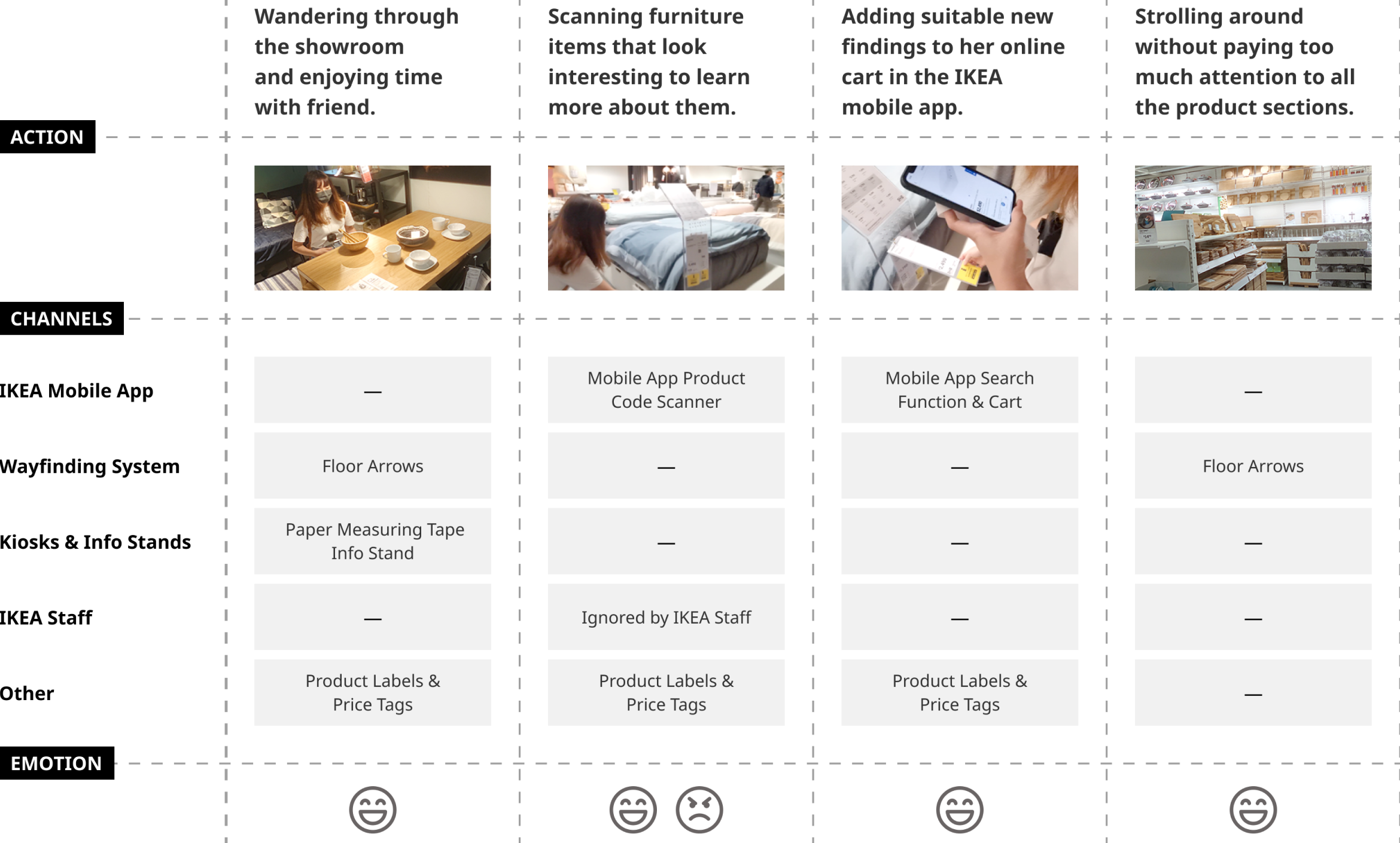
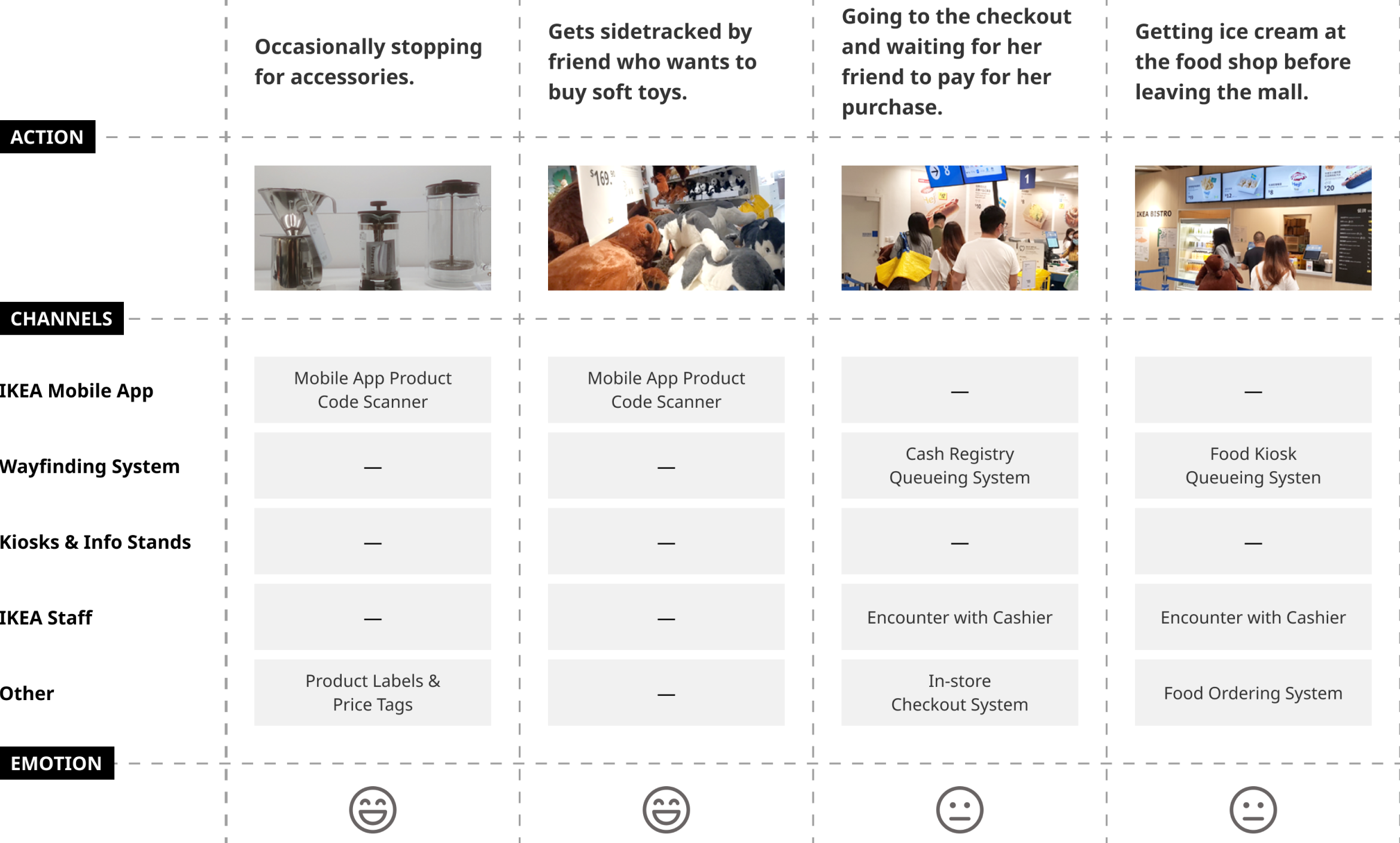
Role Play & Site Visit
Channels
Everything you need to know about IKEA (and more) in one place.
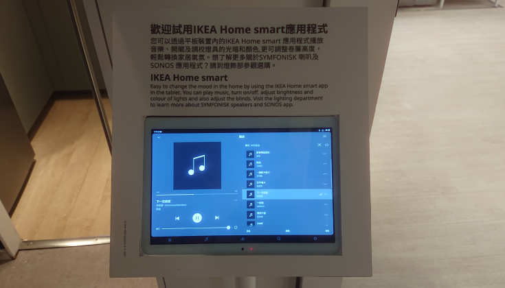
Browse through the online shop and scan items at the IKEA store.
Try out different furniture items directly at your home.
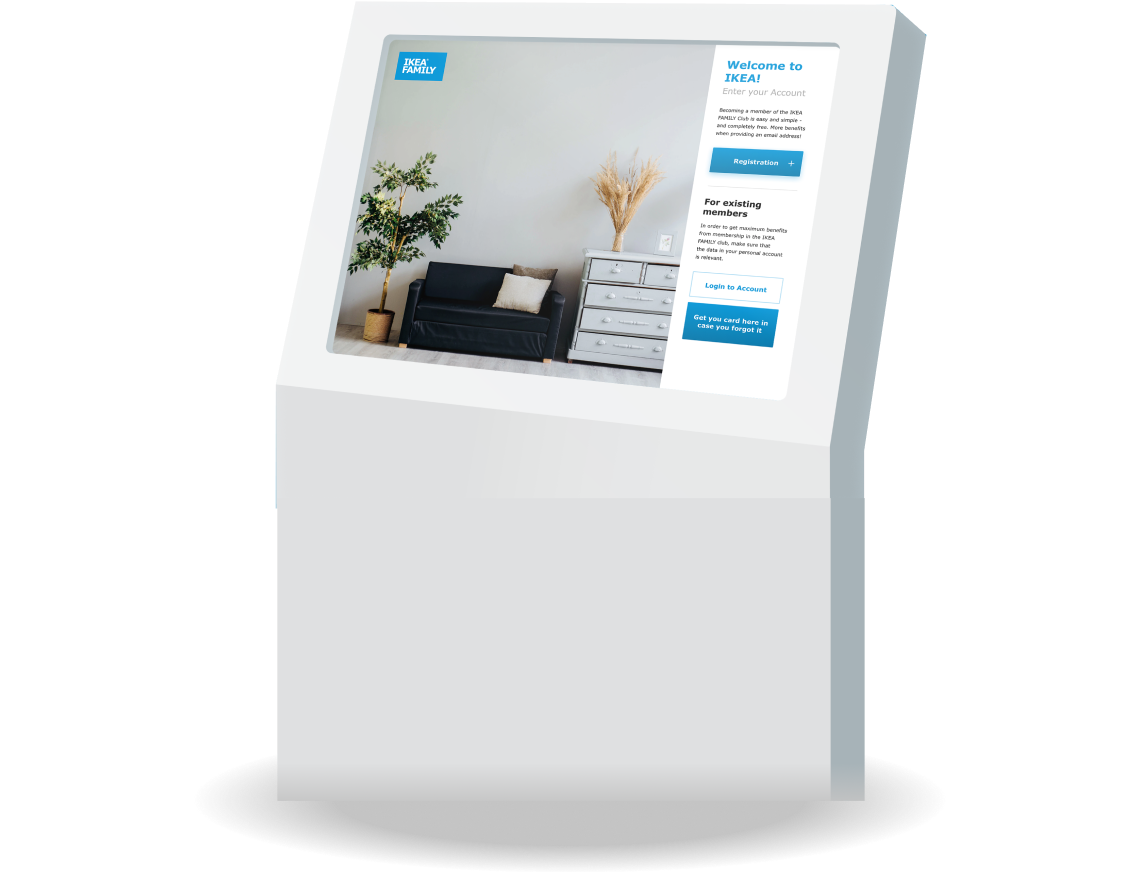
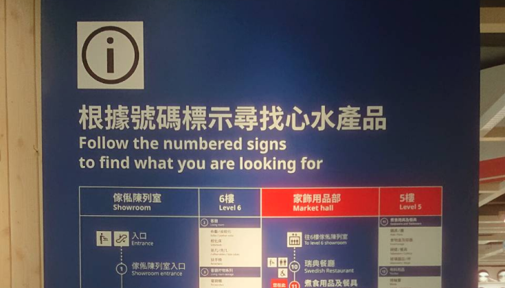
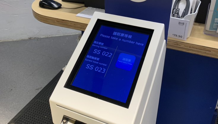
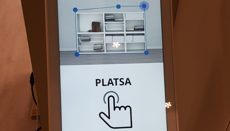
In-store kiosks to help customers to know more about the product information.
Persona
HK Local Young People
User Journey
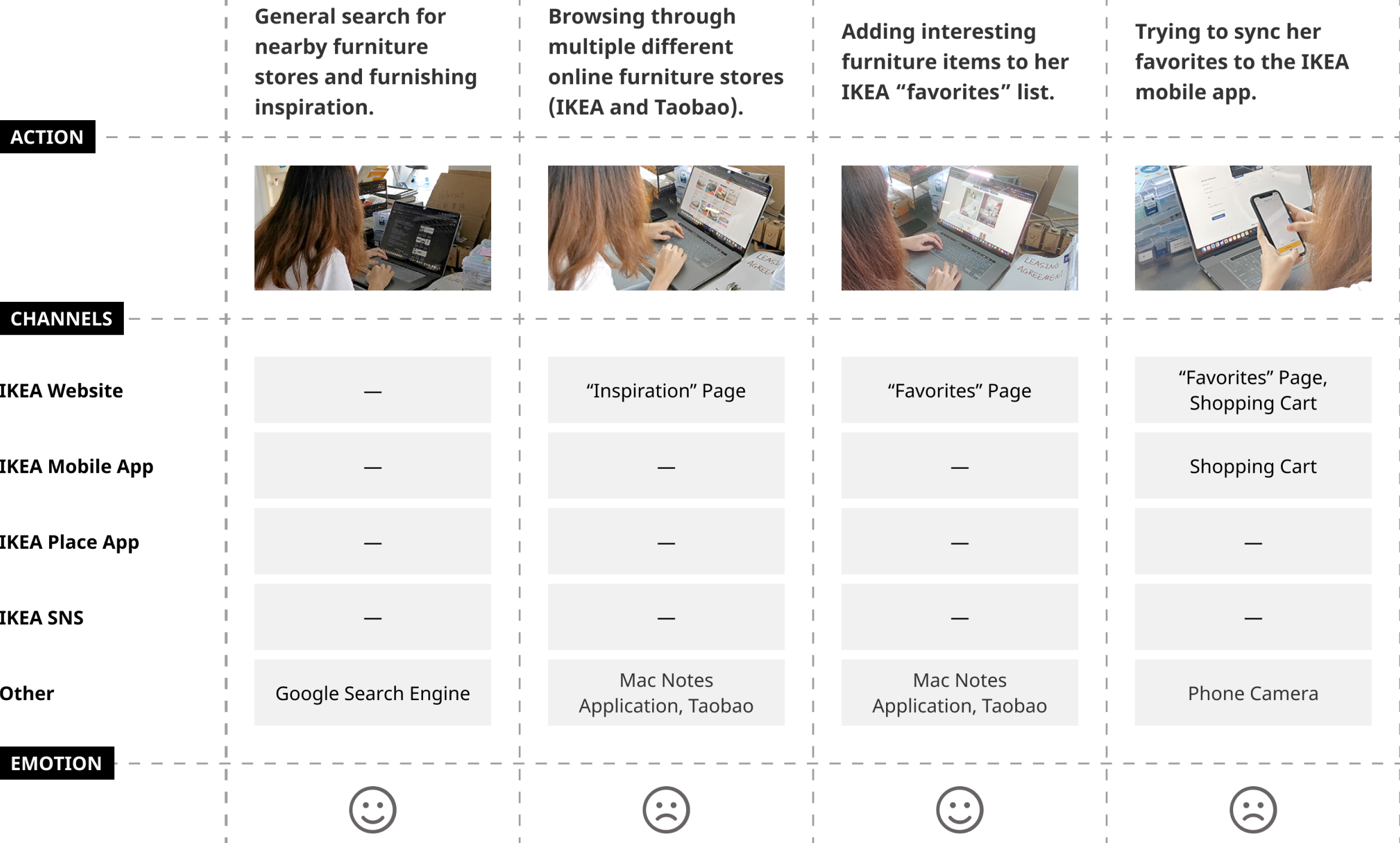
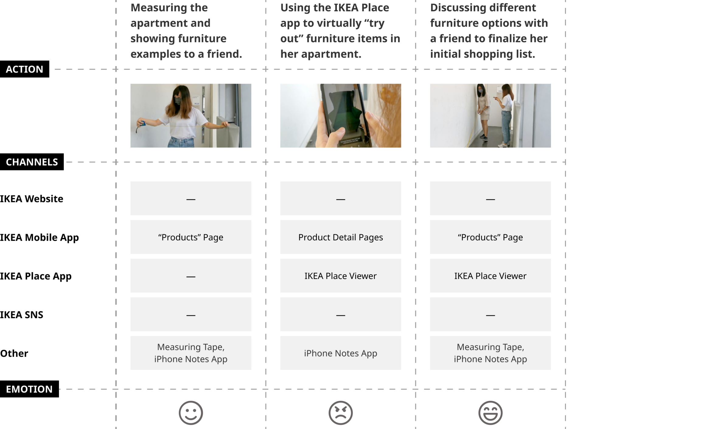
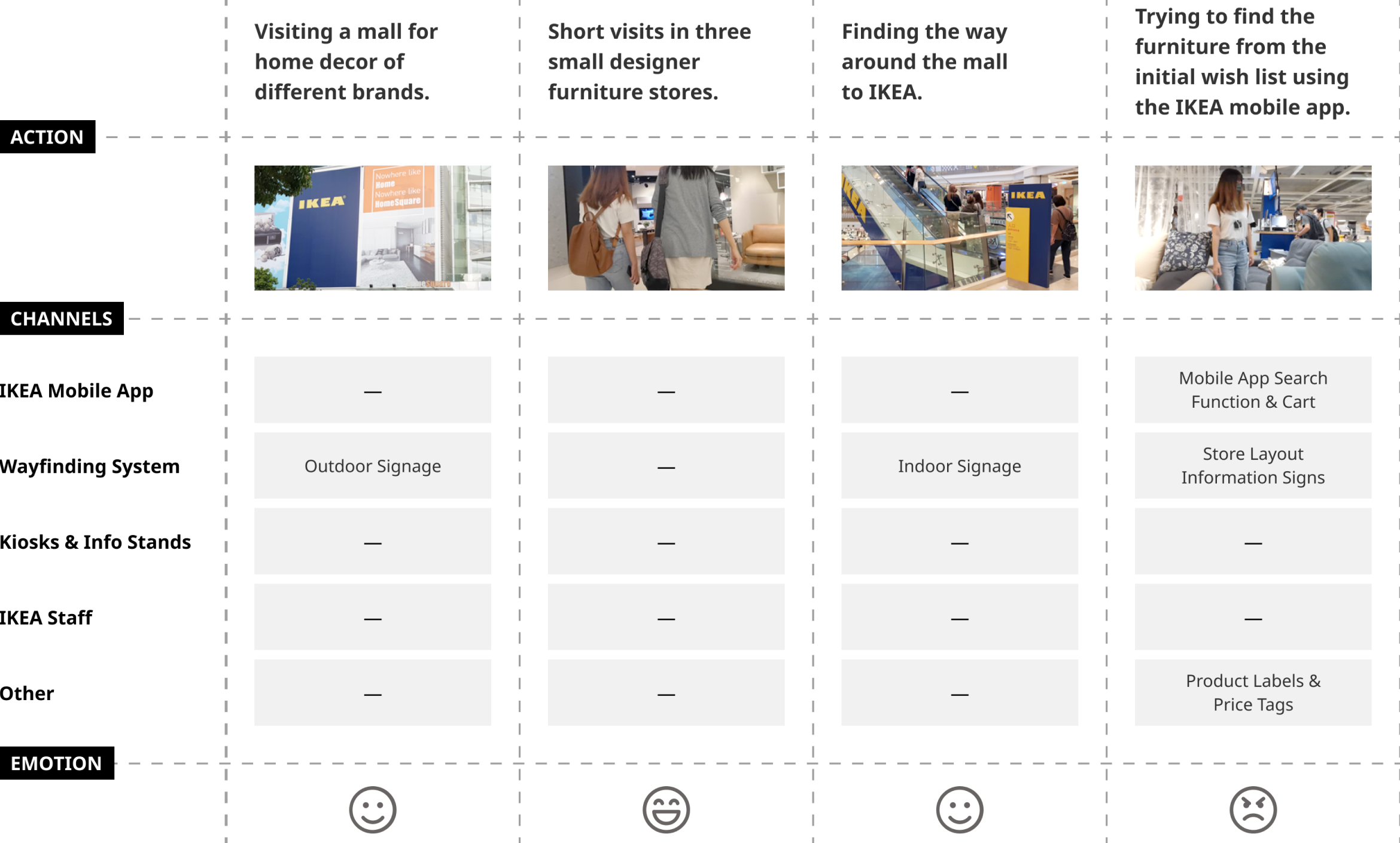
There are mainly four sections for the user journey map.

Get confirmation of the new apartment. Contact family and friends.
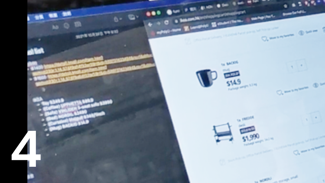
Browse websites and get insights. Consider the style of the apartment and prepare for shop visits.
Visit a big furniture mall and check the selected/similar products.
Follow-up actions after visiting IKEA.
- The Inspiration & Lifestyle section on IKEA Website encourages new ideas.
- The IKEA website has an integrated “favorites” list that allows customers to collect their favorite items.
- Photos in this section are generally overwhelming and feature too many irrelevant details.
- The IKEA Mobile App does not have the same “favorites” feature as the IKEA website.
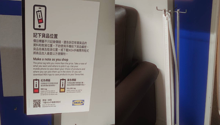
- Distinct product labels make it easy for customers to identify specific products across different channels.
- The casual atmosphere at IKEA store makes customers feel “at home”.
- The IKEA Mobile App allows users to explore more detailed information about specific products.
- Serendipity — Customers can find interesting furniture items and related household products when walking through the store.
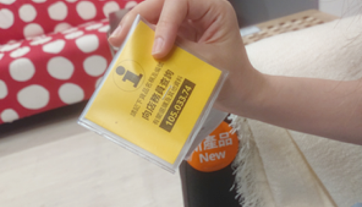
- Lack of information about where to find specific furniture in the store.
- Insufficient information about the IKEA Mobile App product label scanning feature.
- Some product tags do not have the product code.
- The IKEA Mobile App product code scanner is unresponsive and lacks visual feedback; some items cannot be scanned.
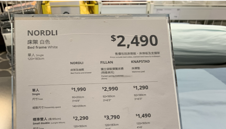
- The inconsistent labeling style of some products is confusing.
Other Channels
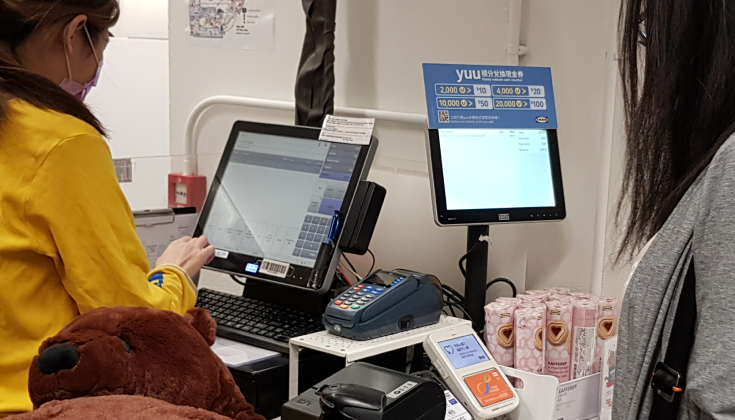
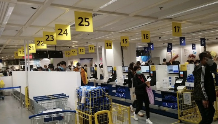
During the site visit, we found several channels that customers will get in touch with IKEA inside and outside the store.

Insights
IKEA Channels
- Interacting with all IKEA applications seems intuitive and straight-forward, even for first-time users.
- Lack of connection between different IKEA online channels → difficult to sync information.
- Other alternative ways to make up for the shortcoming of IKEA’s online channels.
Compare to Designer Stores
- Under “surveillance” of the salespeople since you walk in.
- Can't focus on feeling the products but have to deal with the sales.
#Pressure #Shopping #Tense
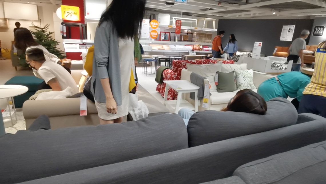
- Casual atmosphere.
- Imagine the new home as a whole
- Not only for the purchase, but also a fun time hanging out with friends.
#Home #Fun #Relaxed
Customer Behavior
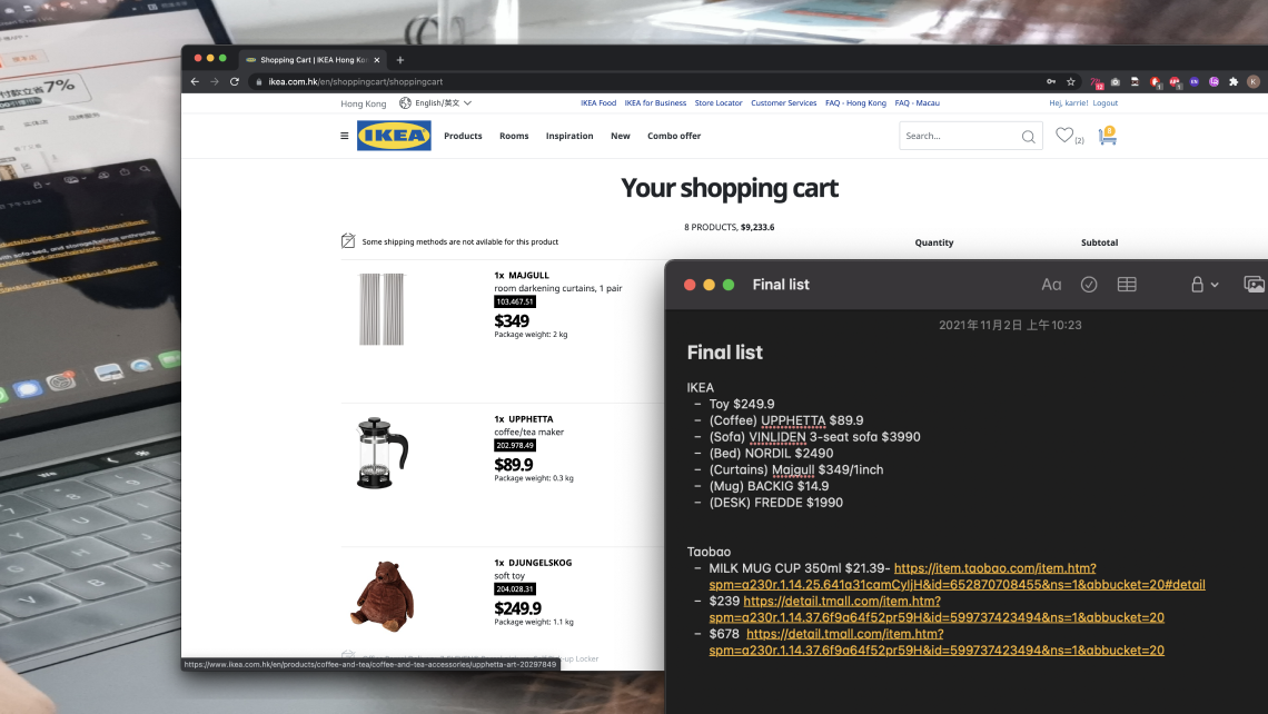
- The user will buy not-so-special products through other channels for lower price even though they decided to purchase during the IKEA store visit.
- IKEA has a naming convention system that's familiar to Swedish but not for local Hong-Konger.
Design Direction
Connect the channels more and make it a seamless experience for the users.
Clean and simple, less cluttered information can help people to make decisions. Especially someone without too much furniture shopping experience.
Overall Architecture
Channel Overview over 4 Platforms
This is the information architecture for the IKEA website, IKEA Place, IKEA Kiosk and IKEA Mobile. We try to add some features based on the research to enhance the user experience and connect the platform by using an IKEA account.

New feature added
Connection to IKEA account
Feature Flow

IKEA Account

New feature added
IKEA Website
Goals

In this project, I will focus on the IKEA website first as this platform is the first touchpoint for our targeted user to start.
In the existing journey, the website can not serve the users' need for getting inspiration, and then the user will leave the website very quickly and decide to go to the store to check out more information, which is not user-friendly. Also, they do not notice a planning tool on the website that may allow them to play around with the IKEA products.
Therefore, the goal for the upcoming enhancement is to provide better insight and research experience for our target users. As the user used to ask friends' advice, we try to make IKEA as the users' friend to give insight and assist them in designing their home.
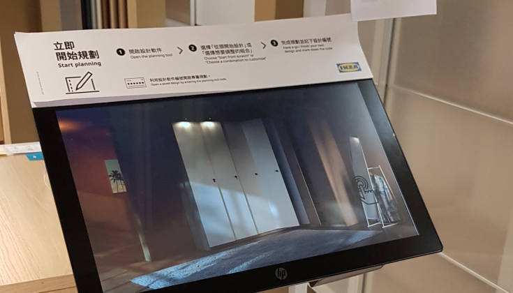
Also, I am going to add the new features to the IKEA website. The 360º demo rooms and gallery about customers' photos on the inspiration page. A creation overview and room editor to enhance the existing planning tools.
Revised sitemap

New feature added
Connection to IKEA account
Simplified Site Map

New feature added
In the new flow, users also first visit the inspiration page, but now there are 360º Demo Rooms and IKEA photo wall that users can get more inspiration from both IKEA's and other customers' suggestions. After that, there is a shortcut to planning tools, so users can directly start designing their homes after being inspired. And there is a new Room Editor function to assist the user in planning for their design.
Showcase
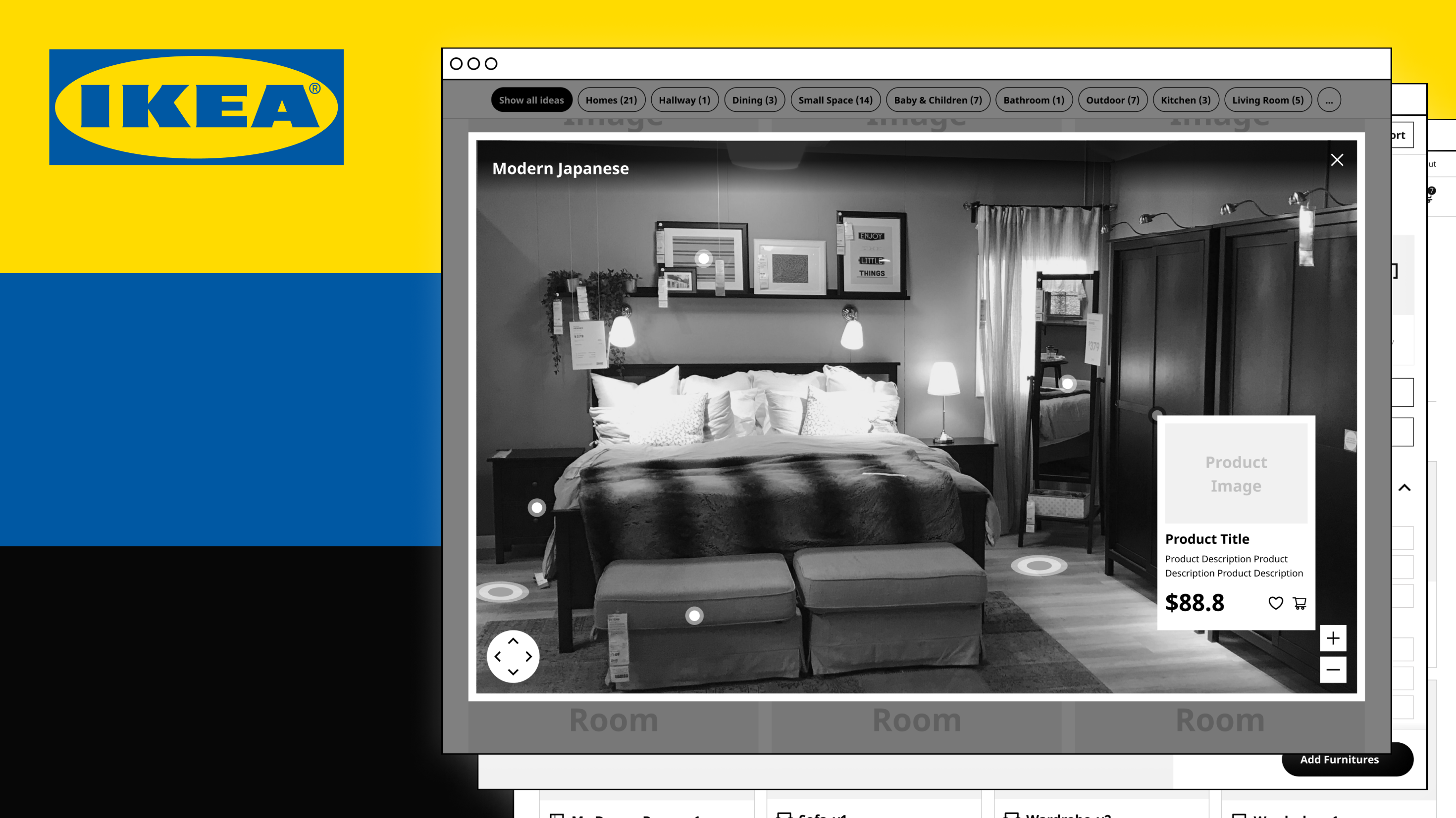
Inspiration Page
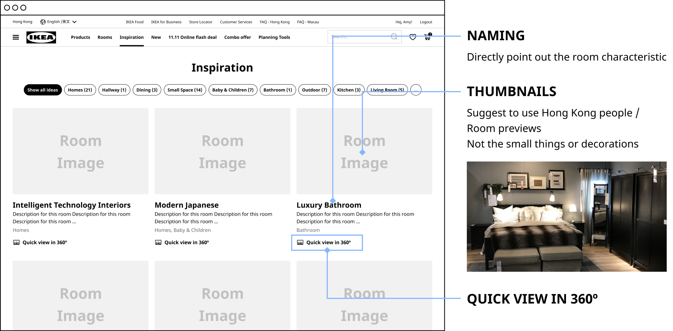
On the inspiration page, to better support the user to imagine their room. The inspire cards should directly point out the room characteristics with the room preview photos on the thumbnail but not close up to small items.
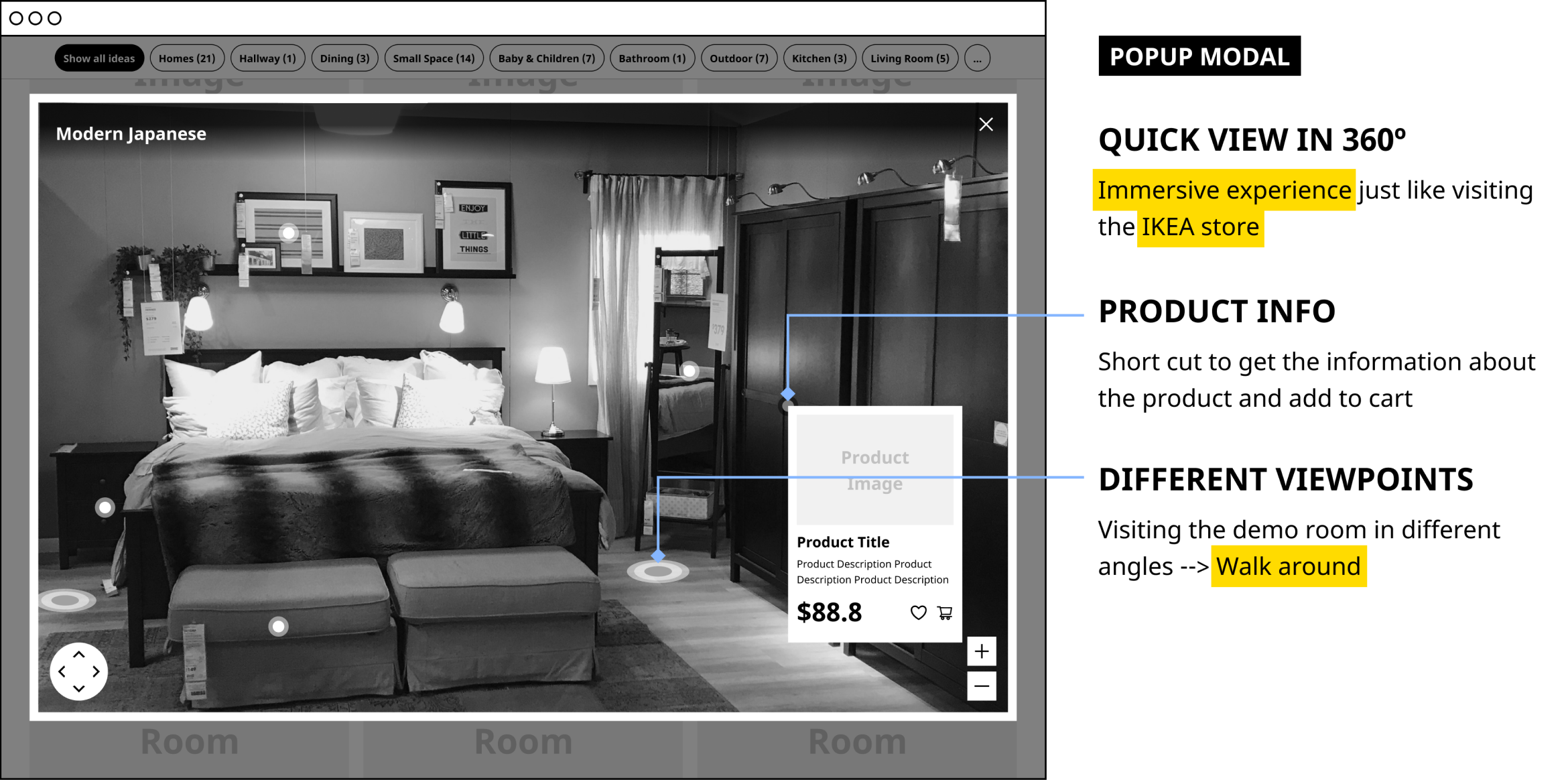
When clicking the Quick view in 360, a popup modal shows the interactive demo room. Users can have the immersive experience of visiting a demo room just like visiting the IKEA store. They can also try different viewpoints and get the product information from it.
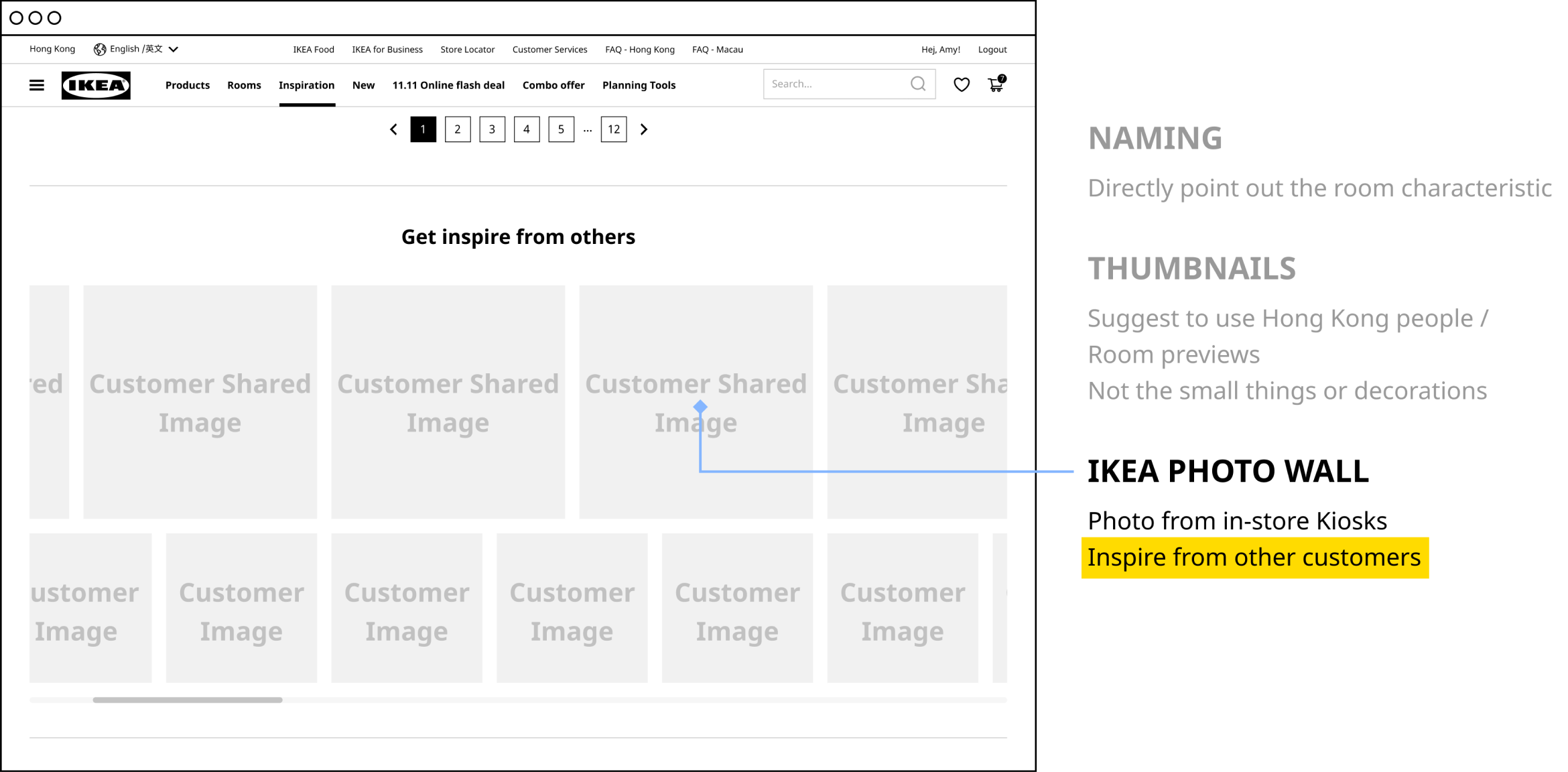
There is an IKEA Photowall section. Those photos are taken from the Kiosks at the IKEA store. Users can get inspiration about how are others decorate their rooms here.
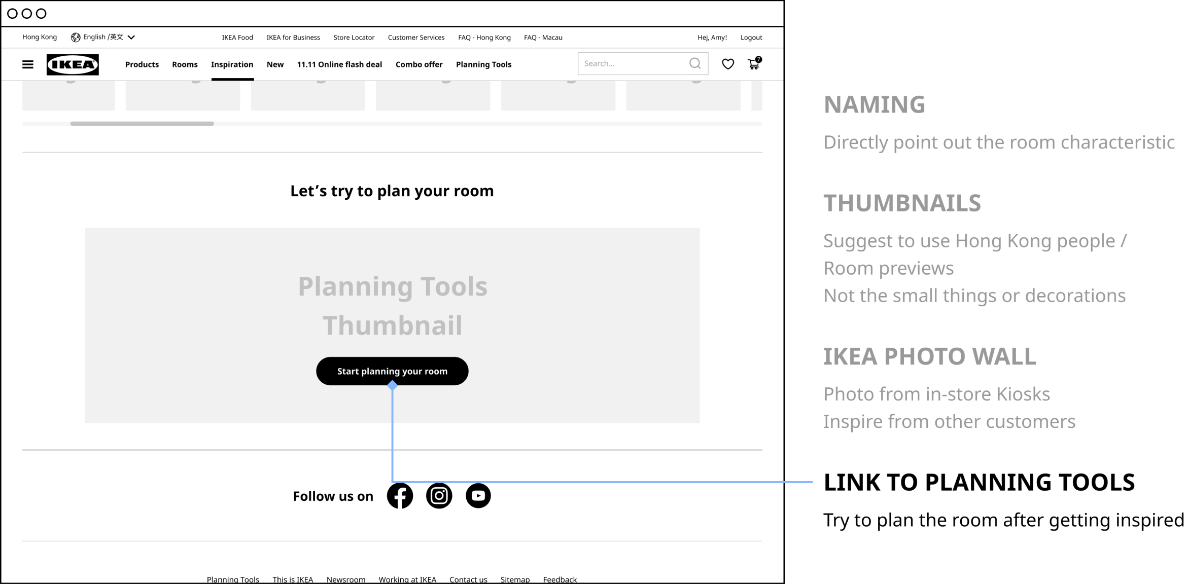
At the bottom of the page, there's a section that links to the planning tools that allow the user to start their planning after getting inspiration.
Planning Tools
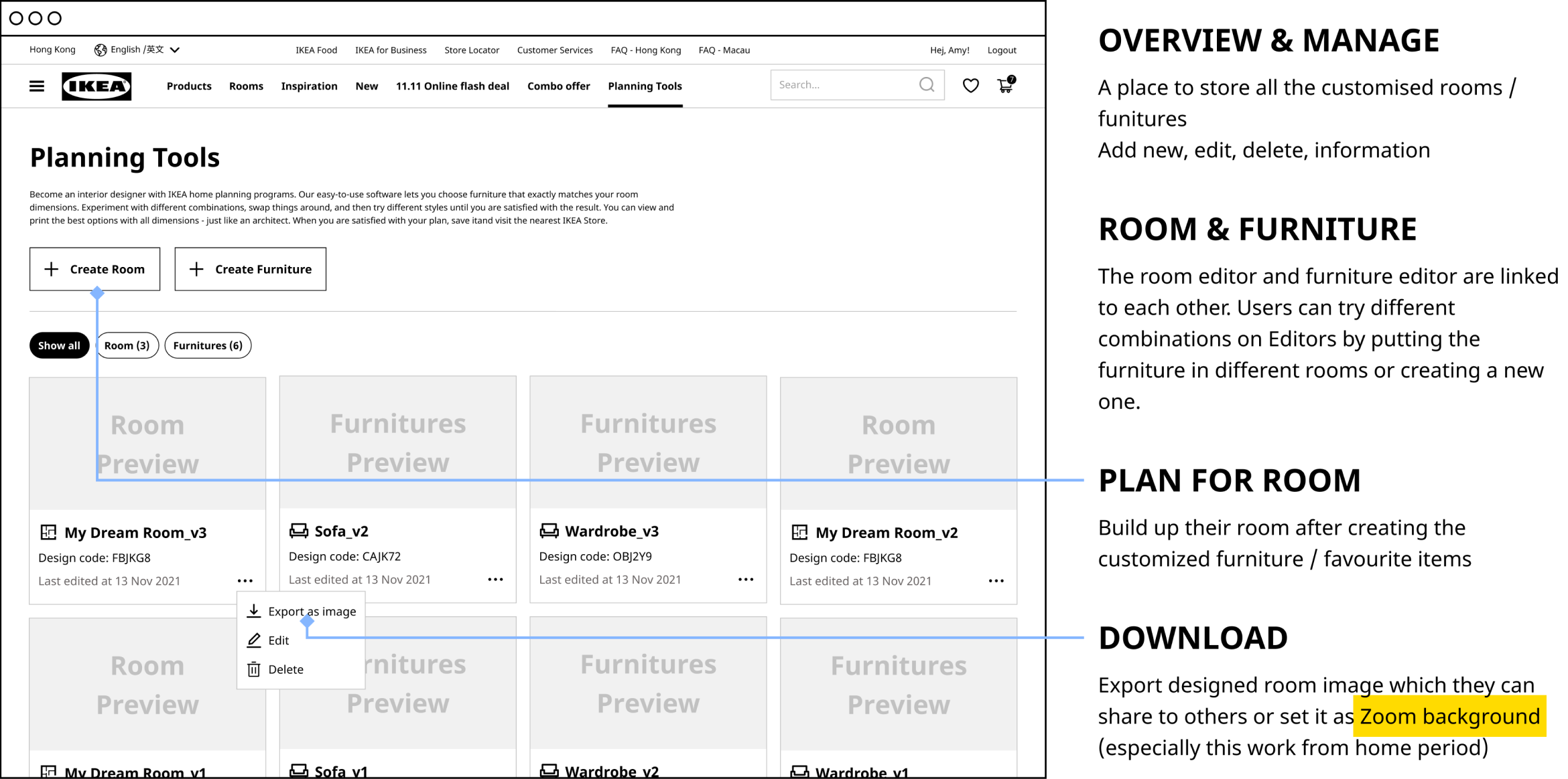
On the Planning tools page, all designs will show here. After they buildup some designs, they can also download them as an image to imagine the room as a home. For example, set it as a Zoom background, especially this work from home period.
Room Editor
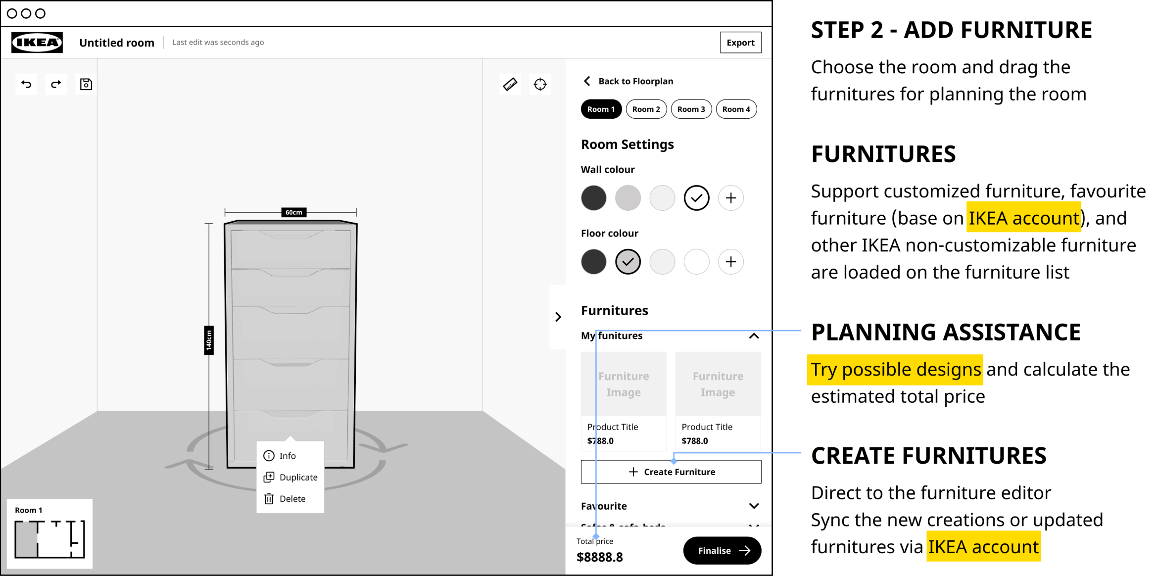
Next, they can drag the furniture room by room. Here, it will connect to the IKEA account to load the customized furniture and the furniture in the favorite list. While editing the room, they can try different combinations and possible changes for the furniture and get the estimated price to make sure their planning is under control and budget.
Reflections
Creat for Omnichannel
In this project, I got a chance to study the omnichannel experience. Not only different platforms on the online but also the offline environment. Like inside the store, mall, or the outside the mall. I have to think deeply about the journey walk through different channels and entry points, and hows they connect to each other. It is a great chance as well as a challenge to revamp and enhance a big company. However, I just covered the website part for this project. Next time, I would love to make a full design for all the channels.
Become an Observer
I was the main character in the role play this time, and a foreign took the responsibility to observe my behaviors and ask for the reason behind my action. I thought he was an excellent observer that he could find out many insights from my behavior that I didn't aware of. I will take him as a good example and study his strengths for my next project. I hope I can have a chance to observe a user well, even a foreign.